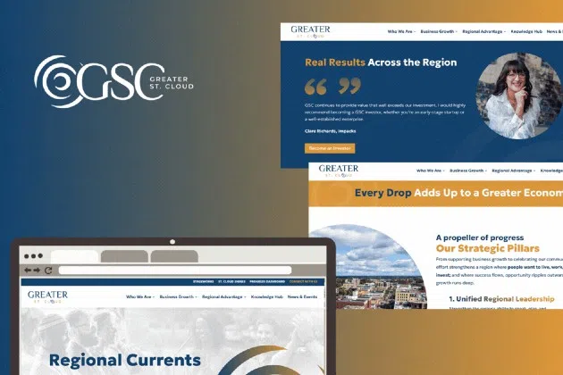
(KNSI) – The Greater St. Cloud Development Corporation will keep its mission but has a new logo, website, and name. The organization is now known as Greater St. Cloud.
According to Greater St. Cloud CEO and President NeTia Bauman, the revamp reflects a clearer, more unified identity for the region and aligns with how the community has come to recognize the organization. She explained that the organization connects people, ideas, and opportunities, sparking the kind of steady, meaningful growth that strengthens businesses, supports communities, and builds a stronger future for Central Minnesota.
At the center of the new logo is the ripple. Officials say it’s both a geographic and symbolic anchor—a nod to the Mississippi River, a defining feature of the region—and represents the ripple effect of economic development, which can set off waves of opportunity.
The new website introduces a customized Regional Progress Dashboard, the first of its kind in the organization’s history. The dashboard integrates real-time data from the Census, the Federal Reserve, and other key sources to provide a live snapshot of Central Minnesota’s demographics and economy. It also tracks goals, timelines, and progress.
___
Copyright © 2026 Leighton Media. All rights reserved. This material may not be broadcast, published, redistributed, or rewritten, in any way without consent.


FOLLOW US FOR INSTANT UPDATES!


FOLLOW US FOR INSTANT UPDATES!